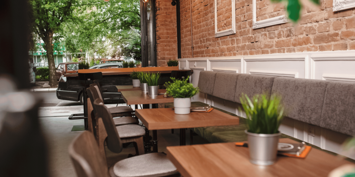
Design Contrast Defines the Café Experience
A successful café blends visual tension with physical comfort. Velvet seats and concrete floors represent more than style choices—they signal a layered experience. One softens, the other grounds. Together, they guide how people engage with the space.
Soft Textures Invite Long Stays
Velvet adds warmth through touch. It suggests ease without requiring words. When someone sinks into a velvet seat, the message is clear: stay a while. These surfaces don’t just support the body—they support pause, comfort, and observation.
Hard Floors Shape Traffic and Tone
Concrete keeps things in motion. It reflects sound and cools the air. This base encourages flow. Guests step lightly, conversations shift, and the atmosphere stays alert. Concrete anchors the space, making soft textures feel even more intentional.
Material Pairing Reflects Brand Identity
The tension between comfort and edge signals the café’s design philosophy. A space that mixes polished concrete with plush seating tells visitors it values both aesthetics and experience. This contrast reinforces branding that is both modern and human-centered.
Lighting Enhances Material Mood
Spotlights on velvet make it glow. Reflected light on concrete gives it depth. How each surface interacts with lighting changes the room’s energy. Shadows soften on fabric and sharpen on stone, creating dynamic visual balance.
Seating Zones Offer Choice and Function
Not every seat in a café serves the same purpose. Velvet chairs suggest lingering, while bar stools on hard flooring suggest quick stops. Designers use material contrast to direct behavior without signage, giving guests silent permission to choose their pace.
Temperature and Texture Work Together
Velvet feels warm, especially in colder months. Concrete stays cool, even on busy afternoons. This temperature contrast helps the café feel alive, adjusting naturally with the time of day. The mix of warm and cool textures builds a tactile landscape.
Durability Meets Design Expectations
Concrete handles traffic. Velvet demands care. Their pairing sends a message about balance: rugged use doesn’t exclude style. These choices show that the café respects wear without sacrificing atmosphere. The space looks lived in, not worn out.
Acoustics Respond to Material Choices
Soft surfaces absorb sound, while hard ones carry it. A café with both finds a middle ground. The hum of conversation doesn’t overwhelm, and silence doesn’t feel empty. This balance helps maintain a comfortable energy across the day.
Contrast Builds Memory and Meaning
Guests remember the way a space feels. A mix of velvet and concrete sticks in the mind—a moment of softness in a strong frame. This physical memory connects to the café’s larger identity. It becomes part of the story people share.
Style with Substance Keeps People Coming Back
The contrast between comfort and structure invites repeat visits. It creates a layered experience where style supports use. Guests don’t just drink coffee—they feel held by the space. And that feeling, built through thoughtful contrast, makes all the difference.